Netflix Trades in Monstrosity for Modern
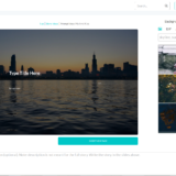
In an effort to modernize, Netflix has replaced their severely dated player with a much more modern looking video playback area. Maybe it’s me, but they seem to have taken design inspiration from Windows 8’s video player design.
In the new player they use a modern sans-serif font with some snazzy new features to really bring it into the modern world. For starters, it feels faster although that may just be perception. Things feel snappy and clean. The player is minimalistic with just a few fading bars for controls. For TV series they revised the episode finder built into the player so that simply by clicking on any episode you can get a synapsis and screenshot. This feature is especially helpful for my law and order addiction because their titles are notably vague (i.e. Shandeh) and it’s nice to know what it’s about before choosing an episode.
 |
| Courtesy: Netflix |
The timeline is also much improved because as you scroll along it gives you screenshots of what is happening in that scene for easier selection. None of this is new technology but it is new to netflix so it’s noteworthy.
The final design change noticed is the pause screen which instead of it just showing a still of where you
are it shows the synapsis and title for the episode in a much more informative and aesthetically pleasing style than the previous.
These changes aren’t revolutionary, but they’re a step in the right direction for the aging netflix (now 15 years old). The old interface was dated, ugly, and felt slow. The new interface is clean, modern and should help netflix progress well into the future. Rarely have I said it recently but… Job well done netflix.

