iOS iCon Competiton – iOS 6 Vs iOS 7
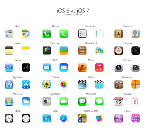
With a massive redesign comes all-new icons, but new doesn’t always mean better, so we decided to rate the operating system’s new design based on an icon competition. We put the old (iOS 6) head to head with the new(iOS 7), and the results may surprise you (even we were surprised).
Rating System:
Each app can receive a maximum of two points. For ties, no points are awarded. Winners get one point, while significant winners based on our judges will receive 2 points. Scores will be tallied twice for verification.
- Maps: The Old Maps is dark, a bit too detailed, and just plan antiquated, while the new maps icon seems to be a significant improvement, offering a much clearer, cleaner look. 2 Points for the new Maps app.
- Phone: The icons are nearly identical, with the exception of the removal of the traditional shine, and a brighter shade of green. Our judges thought the new was a bit too bright, but still had an edge in that it was easier to see. 1 Point for the new phone app.
- Reminders: The old reminders app provided clear imagery of a checklist, while the new was overly colorful, harder to see, and just frankly less visually appealing. 2 Points for the old Reminders app.
- Contacts: The old and new contacts app icons maintain the imagery of a contact book, but have significantly different look and feel. Neither was loved, but both were considered utilitarian enough for their purpose. Tie.
- Once again, two apps with similar imagery but different design styles were very evenly matched. Ultimately the old edged out the new, because the new was simply too hard to see. The yellow distracts from the already barely visible lines. The design changes don’t add anything. 1 Point for old.
- Passbook is a fairly modern logo already, having been unveiled just last year, so it really was not due for a redo. The new design is decent, but the color scheme is a bit too random, and doesn’t express its purpose nearly as well as the old icon does. 2 points well-deserved for the old design.
- Newsstand’s new and old designs are both very subjective. Some love one and hate the other, and others love the latter, while hating the former. The preview display of the old shelves was a major plus, while the ability to place the new modern design in a folder provides a counterpoint. This one was a draw.
- Both compass designs look very nice, but the newer design is a bit harder to see, due to its’ very dark, uncontrasting image. On ease of understanding alone, the old icon won out. 1 Point for the old.
- The old shiny blue stocks icon looks like something you’d find in Windows Vista. It’s cheesy, and overly complicated. The new and modern logo is beautiful, while maintaining the same clear understandability that made the previous icon successful. 2 Points for the new apps.
- The Mail app was beautiful, but overly complex in the past, and the new, simplified, modern iteration is definitely a markable improvement. 1 Point for new apps.
- The new music app caused a deadlock. The old music app wasn’t quite beautiful, but the new design is controversial, due to its very bright coloring. Tie.
- The new camera icon just edged out the old. The new icon was criticized for being a bit too standard, compared to the classy, simple, and unique lens solution apple had been using, but the function of such a clearly labeled icon gave it a slight edge. 1 Point for new apps.
- The new app store icon was a bit too simple, and overthought for our tastes, so 1 point for the old.
- The old “photos” icon couldn’t be called beautiful, but it was clearly a picture. The color wheel/flower design that replaced it is aesthetically pleasing, but not visually clear, and so it lost out. 2 Points for the old.
- The slight modifications on the video icon rounded it out, and modernized it nicely. It’s better looking, but maintains nearly the same design. 1 Point for the new.
- The calculator app’s icon seemed to have been overlooked. The new design puts white on orange, versus the previous white on brown. It looks nice, but it’s hard to read, and a little too bright and colorful. Math doesn’t need color. 1 Point for old.
- The new weather app looks significantly better than the old. As a bonus, by release, this icon will likely be carrying live weather information to the home screen. 2 Points for the new team.
- The new facetime icon was made green to synchronize colors with the messages and phone app, creating a “communication color. It may match better, but it doesn’t look nearly as good as the chrome. 2 Points for the old.
- The brightening and simplification of the messages app looks great, although the colors are still a bit too bright. Overall, a win, and 1 point for the new team.
- The new calendar app was another contentious point. While others liked the modern, simple design, and the removal of the scheuomorphism, others find it too focussed on typeface. Some weren’t happy with the color scheme, while others loved it. Tie.
- There are rumors of a realtime clock serving as the clock icon. If this is true, the clock will win out over the old. If not, it’s a tie. 1 Point for new.
- The new safari keeps the simplistic safari compass, while removing the trivial details of the design. It’s cleaner, more visually pleasing, and ultimately a winner. 1 Point for new.
- The old gamecenter icon was hideous, but the new one is hideous and no longer intuitive. Where with the old icon, you knew exactly what gamecenter was, the new marble design gives no hints. It’s rather infantile and stale as well. 2 Points for the old.
- The new iTunes logo has richer, purer colors, and a larger icon in size. Overall, a win. 1 Point for the new.
Final Tallies
Old: 14 points
New: 14 points
THIS WASN’T INTENTIONAL!
This tie was actually completely random. After all the judging was complete, the scores were tallied. This just goes to proving that there are both benefits and tradeoffs in all aspects of this operating system.
Post your own ratings below to help us break the tie

