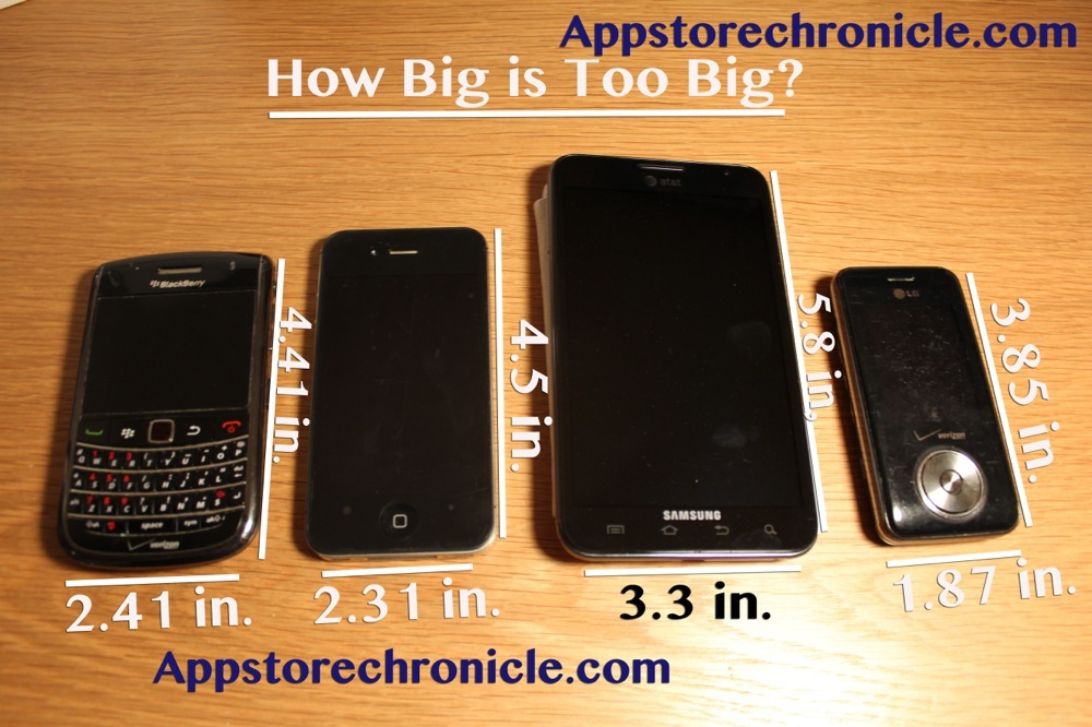
New ipad infograph- Breakdown
Yesterday I had the honor of trying the new ipad for the first time. The screen was incredibly beautiful. The new Retina Display is so high definition, and so high quality, and true-to-life color that it almost feels 3D. It’s hard to imagine those leaves looked better in real life. Anyways, enjoy this infograph showcasing the difference in pixels between the new ipad, and the ipad 2 that I created. These were shot on my iphone camera, and edited in iphoto for ios. Notice that on the new ipad from a close up the pixels are nowhere near visible while on the ipad 2 the pixels are quite visible at an equal distance on the same camera. I’ll have more on my opinion Tomorrow. Enjoy!

Posts provided by The App Store Chronicle- All Rights reserved