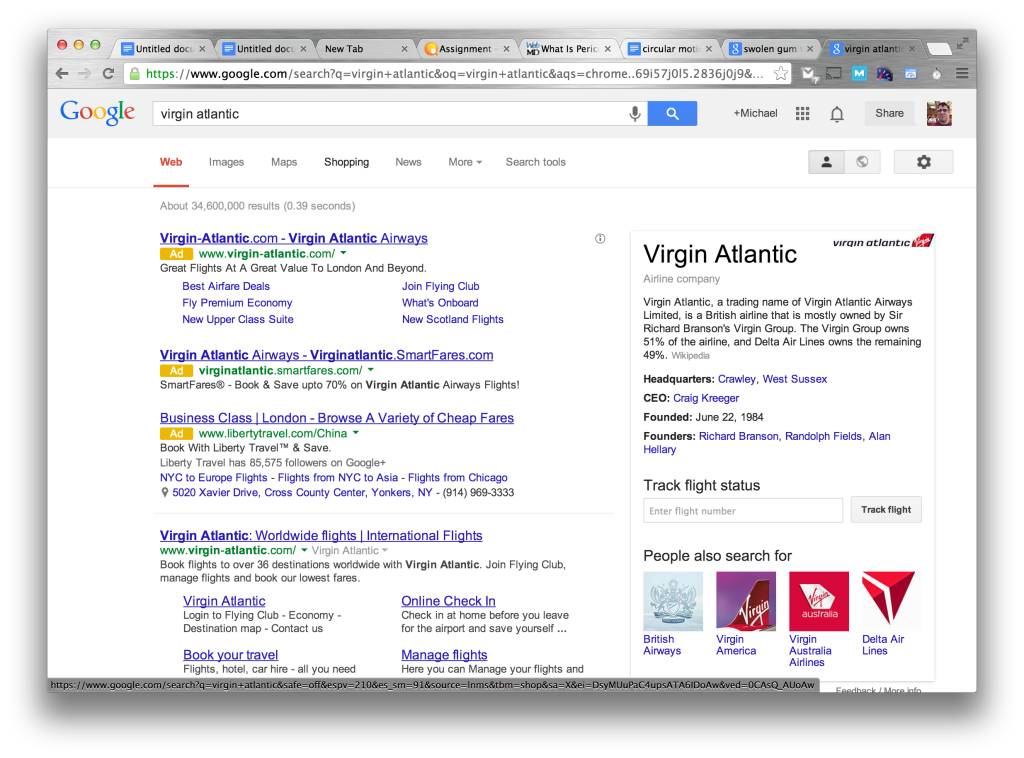
Google has always been expert in design, mastering the art of clean, user-focused pages, but their new ad format does just the opposite. Google’s latest ads occupy nearly the entire search page above the fold, requiring users to scroll down to see anything past the first result. It makes Google unusable, without adblock. It’s so sad, when a company turns away from its mission
This is what Matt Cutts, Google’s head of SEO, had to say about bad websites
“If you click on a website and the part of the website you see first either doesn’t have a lot of visible content above-the-fold or dedicates a large fraction of the site’s initial screen real estate to ads, that’s not a very good user experience. Such sites may not rank as highly going forward.”
Hmm. What website does this sound like?
What do you think? Weigh in with a comment!
Some Chilling Comparisons
Look at some of the search pages with Adblock, versus without adblock. The one on the left (or the top one, if your browser is small) is with adblock, and displays 6 regular “organic” search results, and 0 ads. The one without adblock displays 9 ads, and 3 regular search results.
Below that is my complaint to Google.
What do you think? Weigh in with a comment!
Rather ironic…
Last week, Google started showing messages in a few select markets asking users not to use Adblock, a popular browser extension that removes all ads from the search page. With 3 ads, and a single search result on many of my searches, I felt betrayed though.
I’ve never used adblock before, because I believe in supporting the services I use, but this morning I saw no other choice, and installed adblock (which works perfectly by the way).
I’m one step closer to Bing (or at least Duckduckgo).
