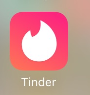
What’s that weird red app on your homescreen? It’s familiar-old Tinder, behind a fresh coat of paint. Tinder has given its app icon a refresh (see below), inverting the traditional red-and-white color scheme, and shifting the vibrant red of the flame into a subtle, pink-ish gradient.
Part

of this is simply an engagement trick. The new logo draws the eye in with its use of color and white space, giving Tinder a second-look from users who forgot it long ago. This is a solution to what some app-store developers are calling “the folder of death”, the folder where users put dating apps to forget about them.
This redesign is also a symbol of Tinder’s recent pivot, from passionate short-term flings (represented by the starkly contrasting, passionate red and white of the old logo), towards more traditional, subtle dating.
Tinder recently unveiled a new service called “Tinder Gold” that will allow paying users to see every user that has swiped right on them (thus eliminating the need to swipe altogether), which is rolling out in the United States within a few weeks.
Now, we wait for the cheesy designer blog post that follows every major corporate redesign, so we can hear about the 100 different logo options they looked at before deciding to literally just flip two colors and call it a day.
I like this new logo. I swiped right.
(Some Relevent Tinder Reading –>)
