This is a slightly dramatized account of my efforts to post on Ello – the newly popular social network. Part of the confusion that ensued no-doubt occurred from my desire to learn the purpose of every meaningless icon.
There are two tasks that should be incredibly easy on a social network – posting, and seeing the posts of others. On Ello, that first one is exceedingly difficult.
Locating The Post Button
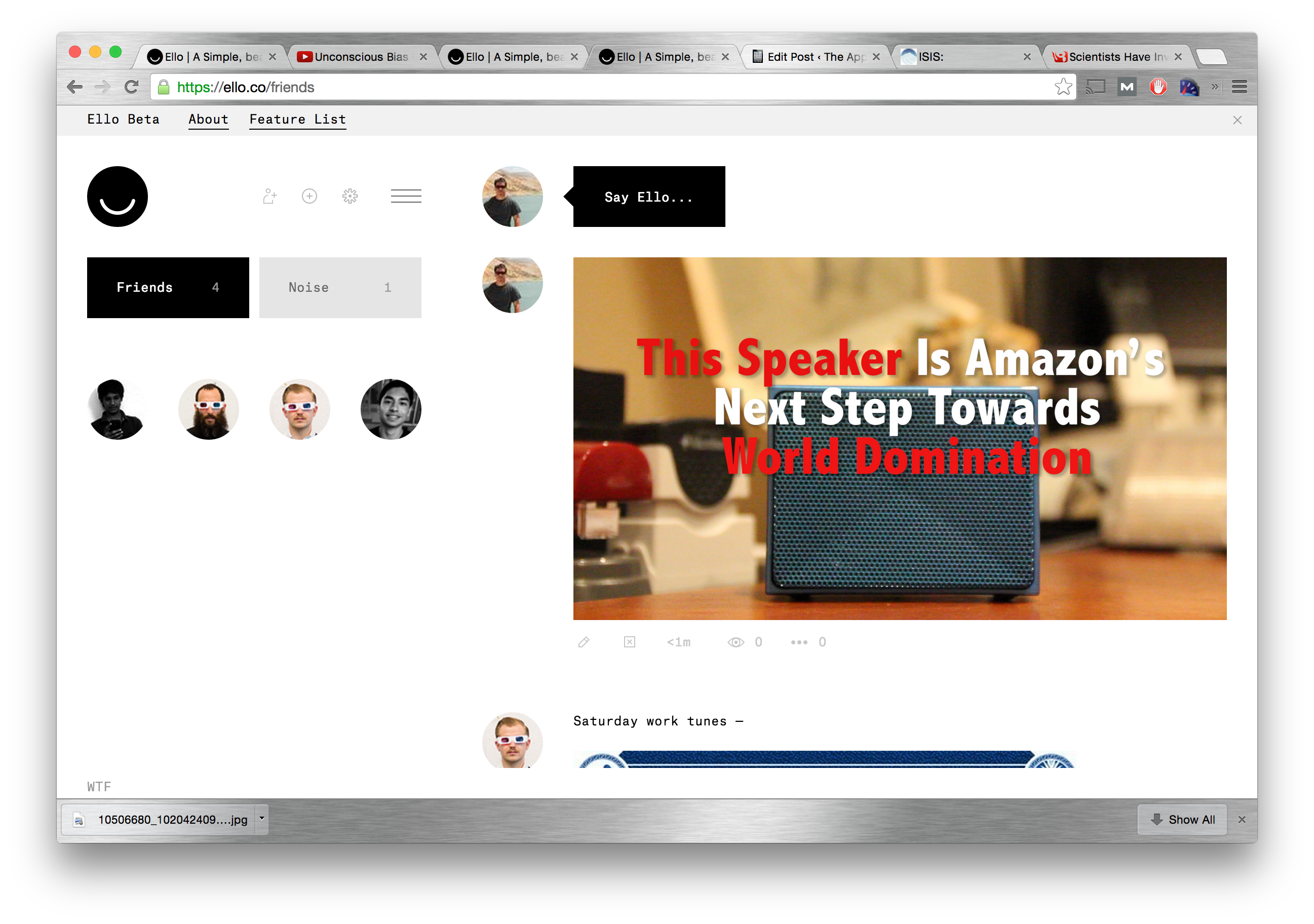
The first mystery of posting on Ello, is actually finding where to post. Instead of a simple “Post” button, Ello has a black speech bubble labeled “Say Hello”. There’s nothing there to clearly indicate that it’s a button, or that it’s meant for user input. Even after I clicked the button, I wasn’t sure that I was in the right place. After the click, some random grey box appeared without instructions as to what it was for, or what I was supposed to do.

The First pitfall for posting on Ello

Getting Lost In A Sea of Grey Boxes
I clicked the grey box, and another grey box appeared, about four times bigger than the first. I clicked the box again, and another box appeared. Unfortunately, none of the other boxes were clickable, so I clicked the first grey box two more times, and two more grey boxes appeared. There was still nothing to indicate what the first box did. Finally after the fifth box appeared, I was allowed to type in the first box, but only in that one box.
Indiana Jones, and the Kingdom Of The Random Buttons
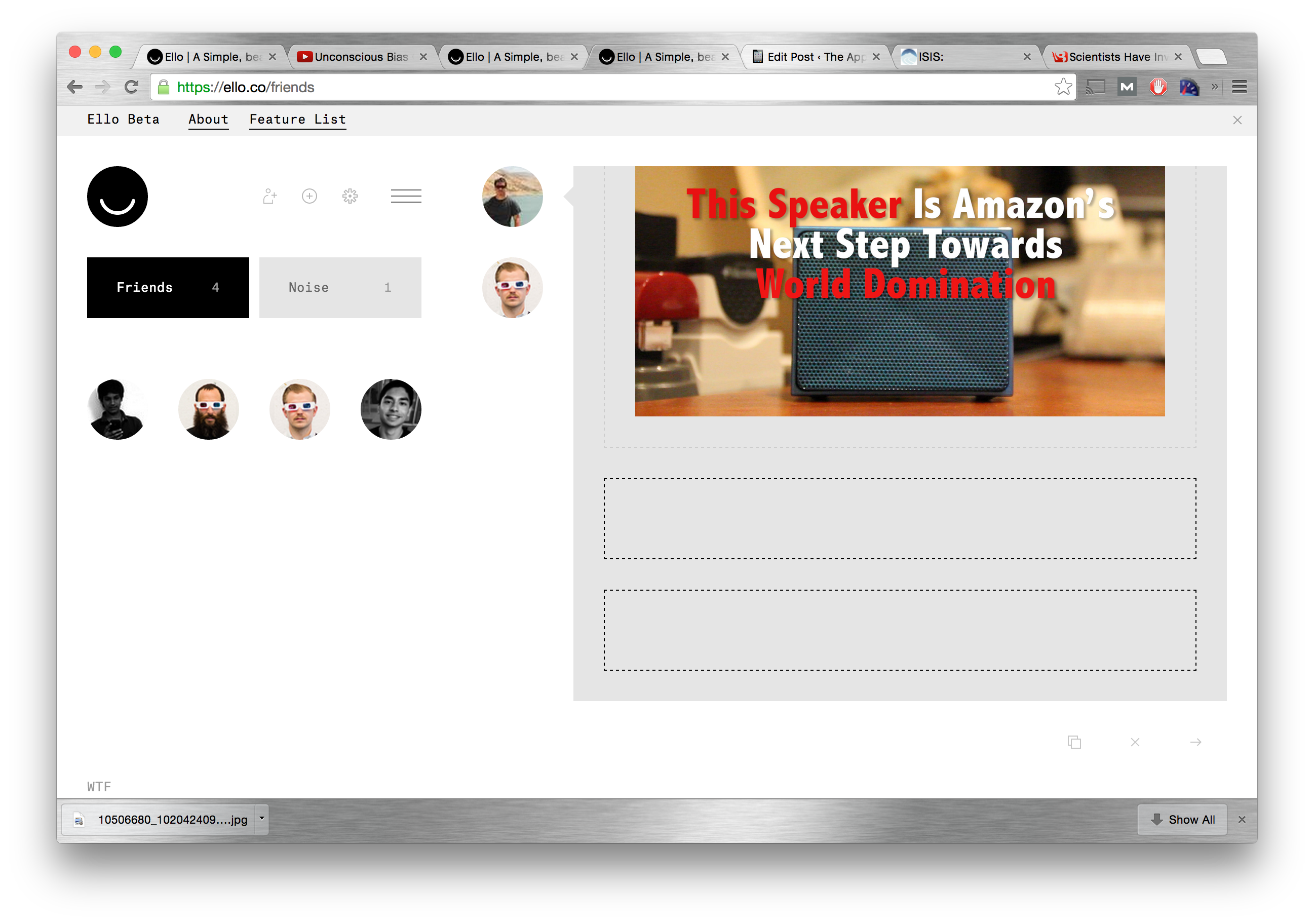
Looking around after typing out my first message, I saw five new icons/buttons scattered around the screne. None had labels. I clicked one with an icon of an “X”. It deleted everything I had written (which didn’t surprise me for an X), and prevented me from re-entering text into any of the five boxes that were still on the page (which did surprise me). Two of the five buttons that had appeared earlier, disappeared, without a hint as to where they went. But the five, empty, unclickable grey boxes remained. I scrolled over another button to click, and noticed that it actually had a label. “Upload”. I probably would have called it “Upload Photo”, because that’s all it can actually upload, but at least it was labelled at some point. I scrolled over the remaining two buttons, and found one to be a “Cancel” button, and one to be the “Post” button, which I was starting to think might not exist.

The first set of random icons

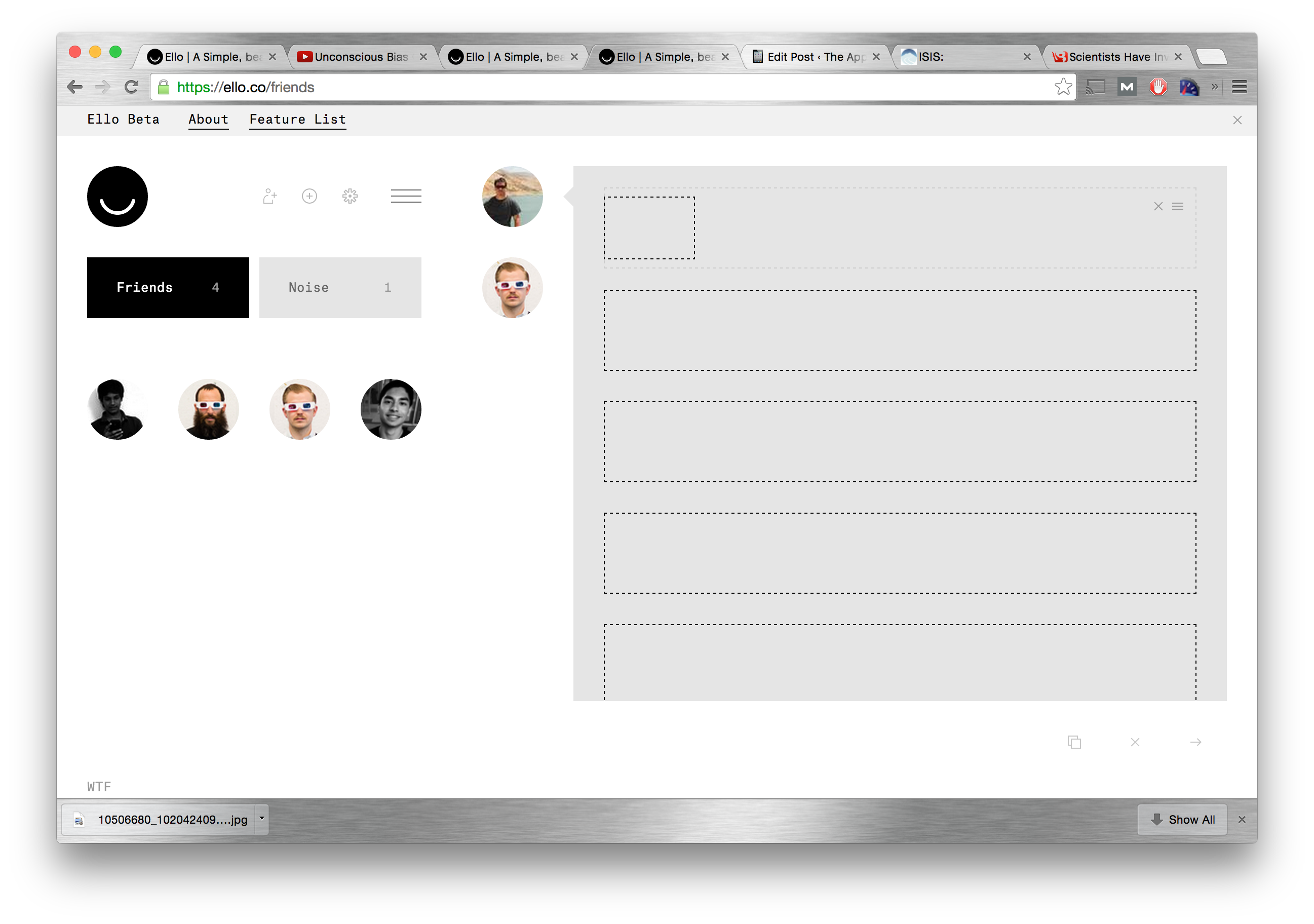
The Second Set of Random Ellon Icons
The Mystery is Solved (Sort of)
I uploaded a photo, but all I could see on the page was those five, empty grey boxes. Finally, I noticed a poorly placed inline scroll bar. I scrolled down to find the photo, four more empty grey boxes, and the two missing buttons from before. I clicked the other button, to see what it did. It created more empty grey boxes (of course).
Finally, I clicked “Post”, to see what would happen to the 11 empty grey boxes, and one box with a photo in it. Everything but the photo dissapeared, and my first photo had officially made it onto Ello. Finally.
The Path Of Most Resistance
I’m perfectly Ok with a product with a limited feature set – especially when it’s in beta, as Ello is. What I don’t like, and what no normal users will every understand, is interfaces cluttered with random icons, without color, labelling, or dividers to give it an order, and make it understandable. Ello was designed with a minimalist design pallate, but it was not designed based on the “path-of-least-resistance” ideology that makes social networks work.
I’m saying goodbye to Ello for the moment. I can’t recommend using Ello at this time – and I sure won’t be using it – but if they can find a way to make it truly usable and appealing without compromising their ad-free, privacy-protecting roots, one day I may reconsider. I’ll keep you posted.
At least I got a three letter username.