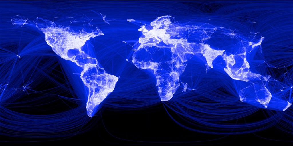
Have you ever wondered what billions of connections, mapped out looks like. Mark Zuckerberg today released a map of the world, represented in friend connections on Facebook. The more friends you have in your area, the darker it is. The map also links each friend, creating an almost-magical view of the world.
A few Things To Notice
- First of all, this map makes clear just how far we have to come in making the world smaller. Most connections are clearly within the same country, and even the same region. Will this map change as we become a (excuse the oxymoron) more global earth?
- Secondly, there are noticeable gaps in the middle east, and South America. This map is a good reminder not to take for granted the freedom of information we enjoy. Many around the globe aren’t able to do the same, either thanks to the cost of technology, or the law of their nation.
-
What does this map tell you? Leave a comment with your observations
